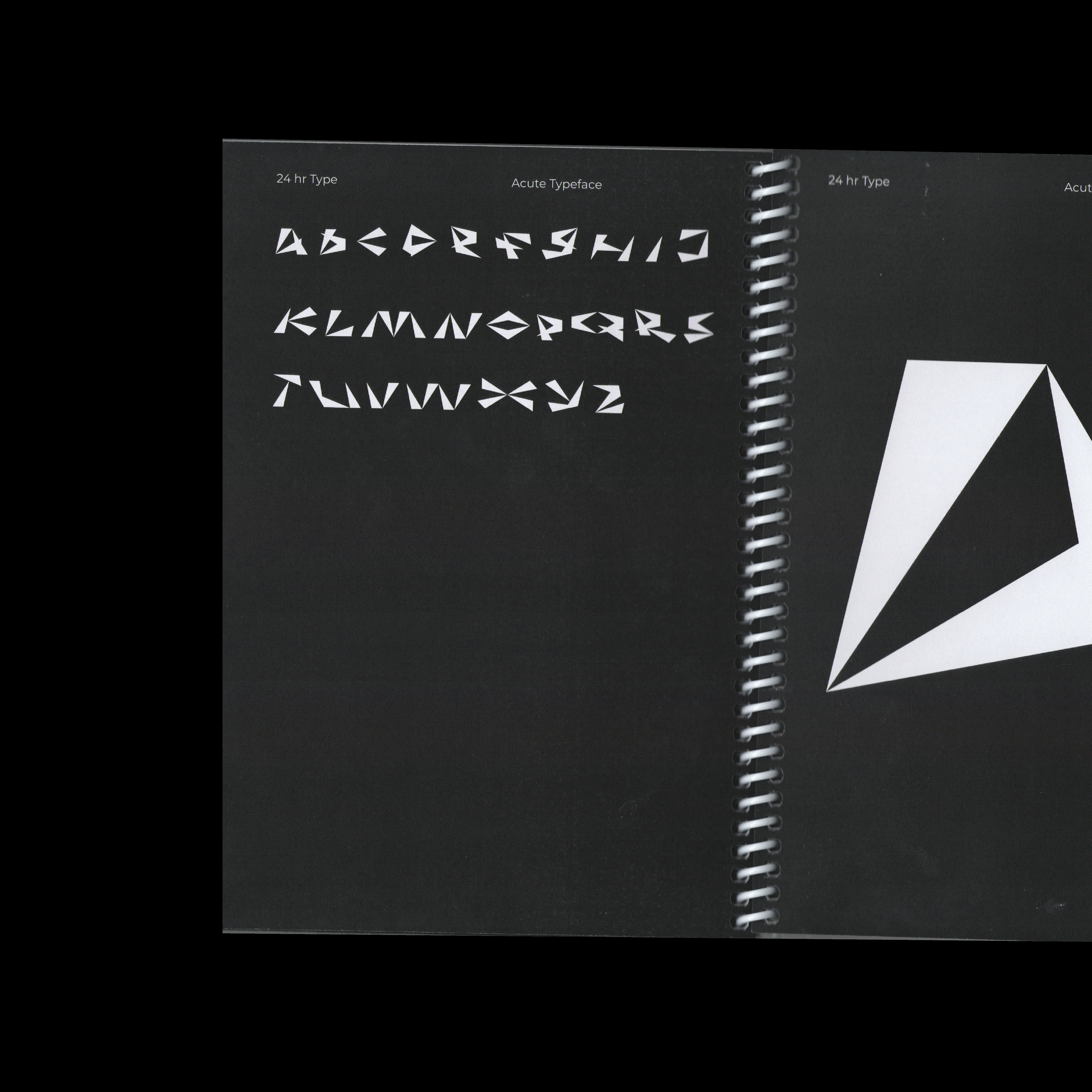
Book
Shape of Words
In collaboration with the wonderful Studio Ground Floor and Open Practice.
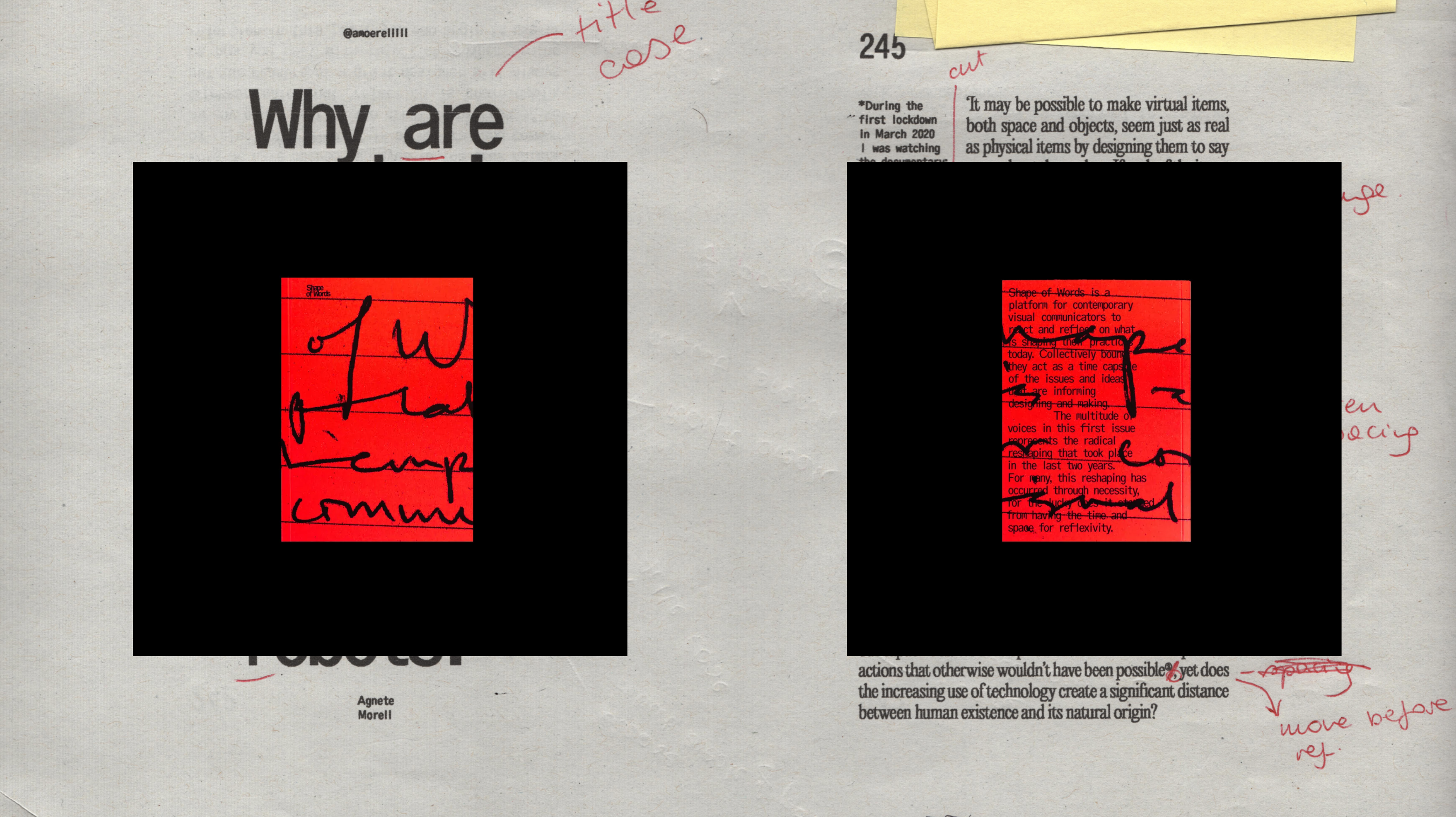
What started as a small idea for a side project with two friends is now a self-published capsule of contemporary creativity titled Shape of Words. Collectively bound, the contributions – including essays, fictional narratives, tweets and screenshots exploring themes of design disequality, abstract letterforms, digital loneliness and lost crafts (to name a few) – illustrate a diverse range of voices surrounding art and design.
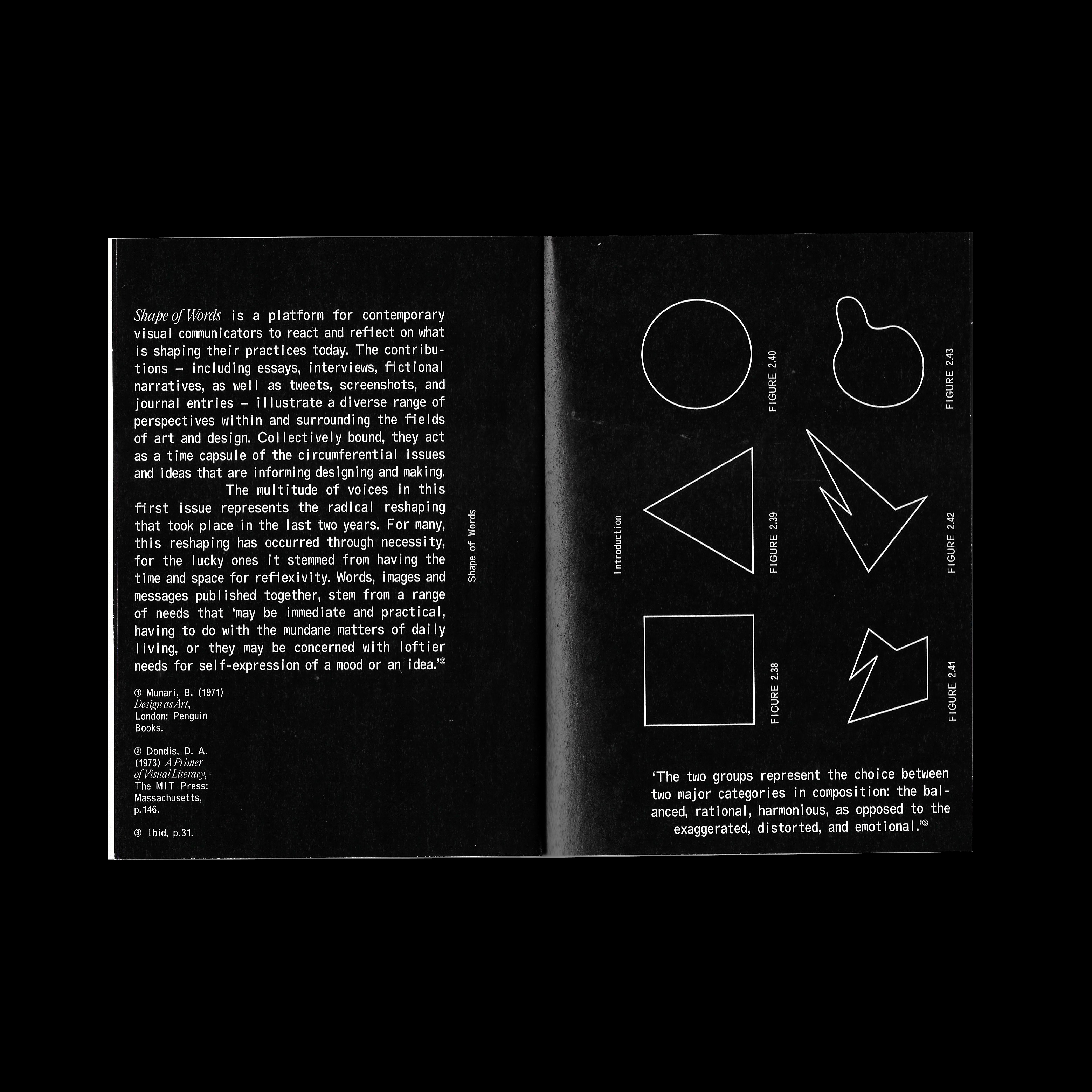
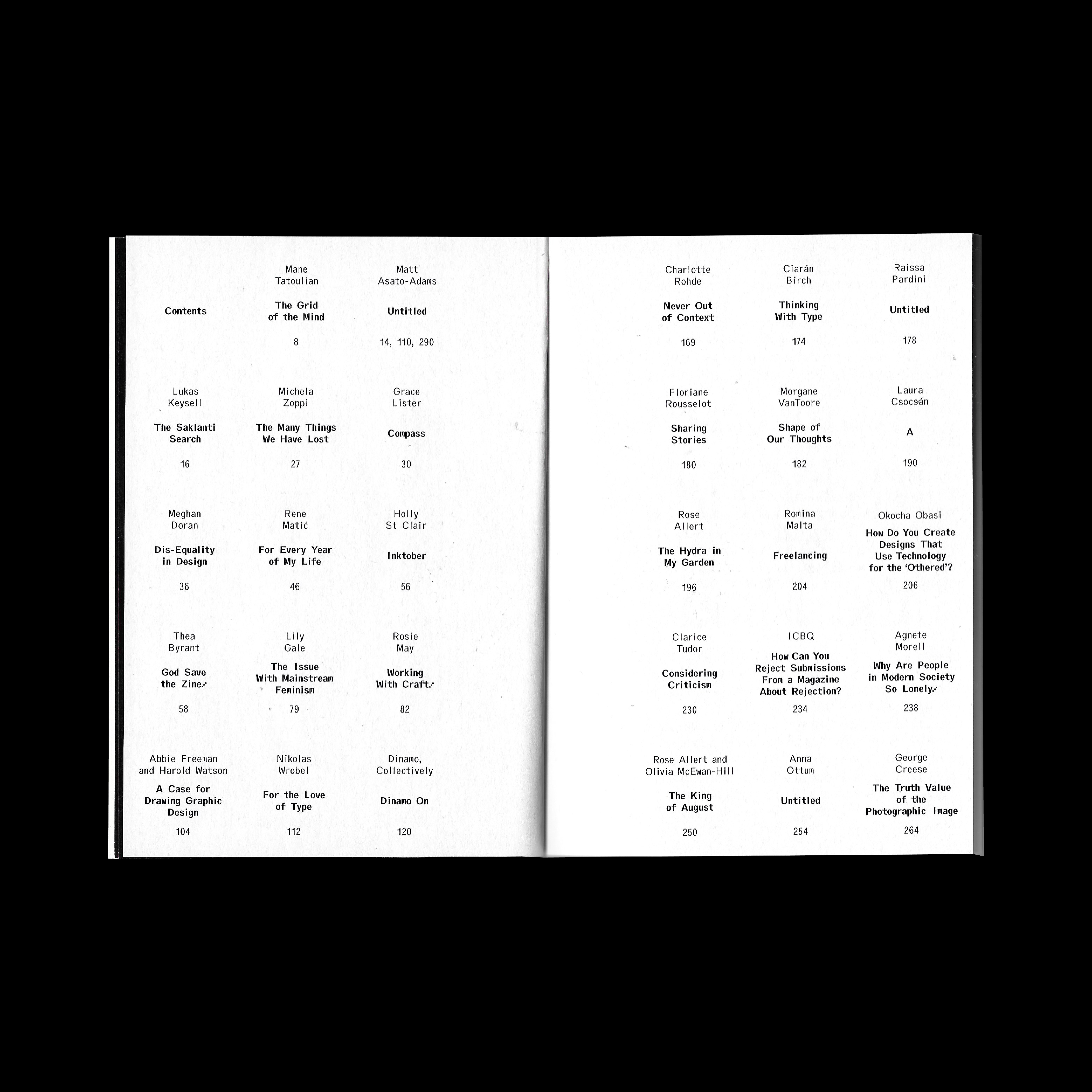
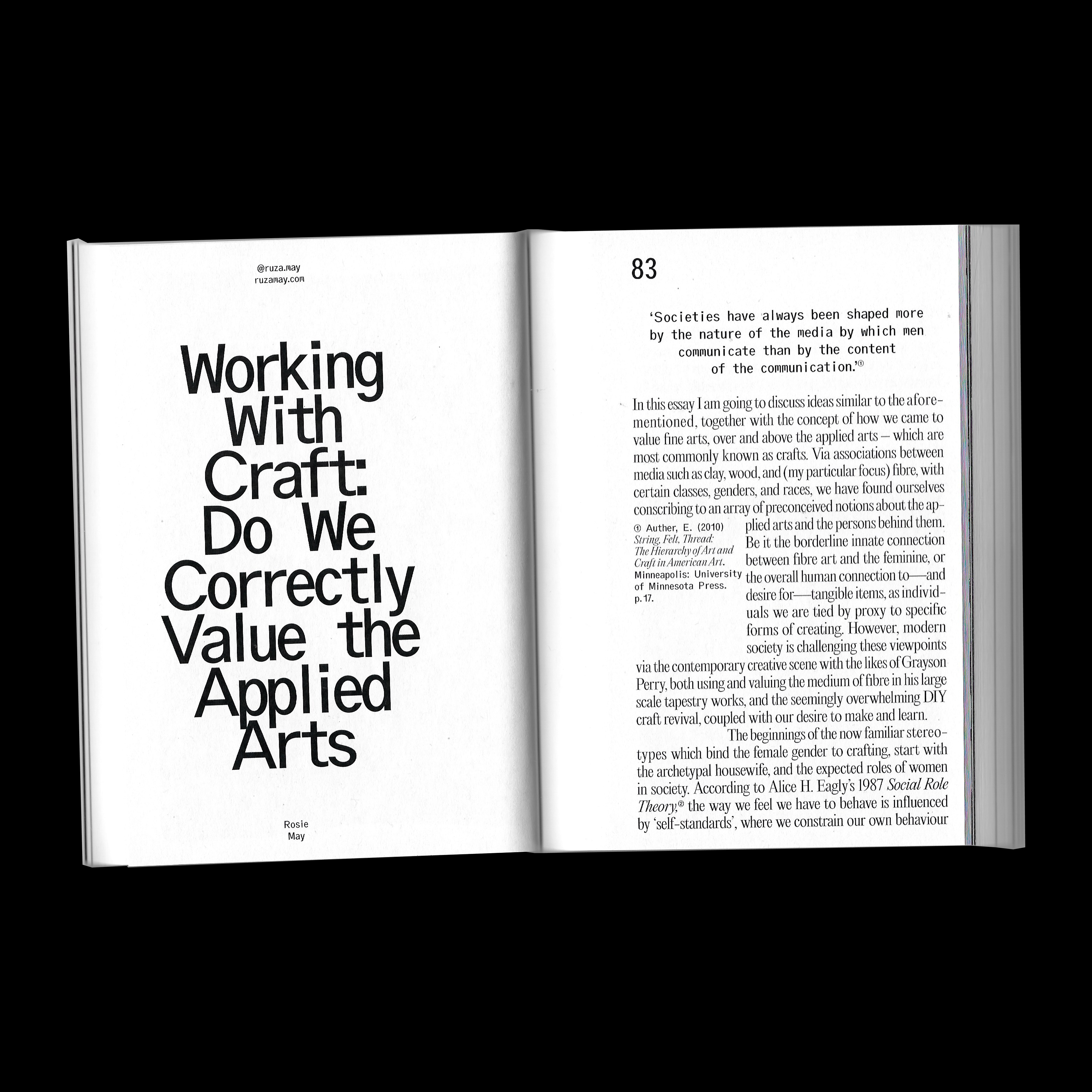


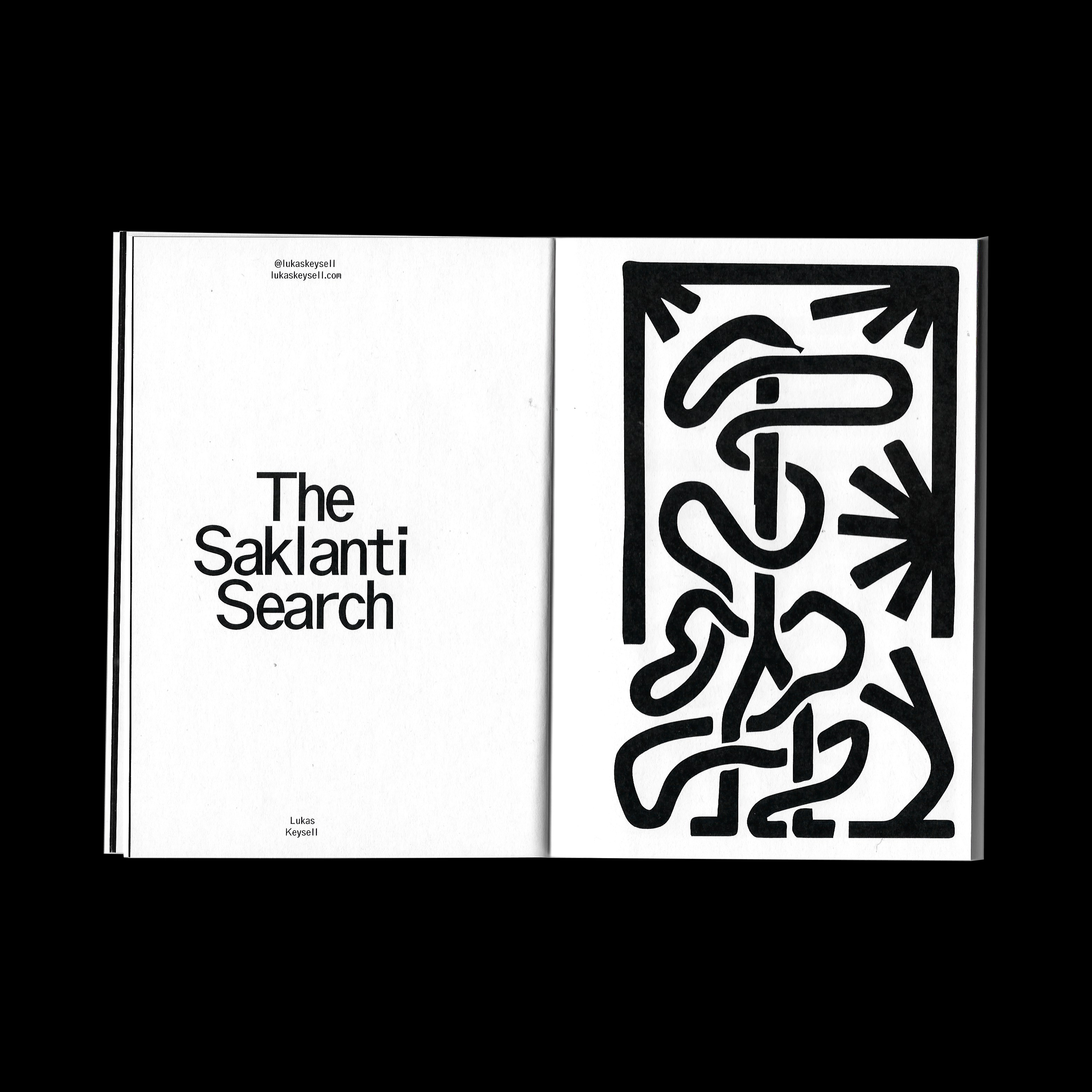
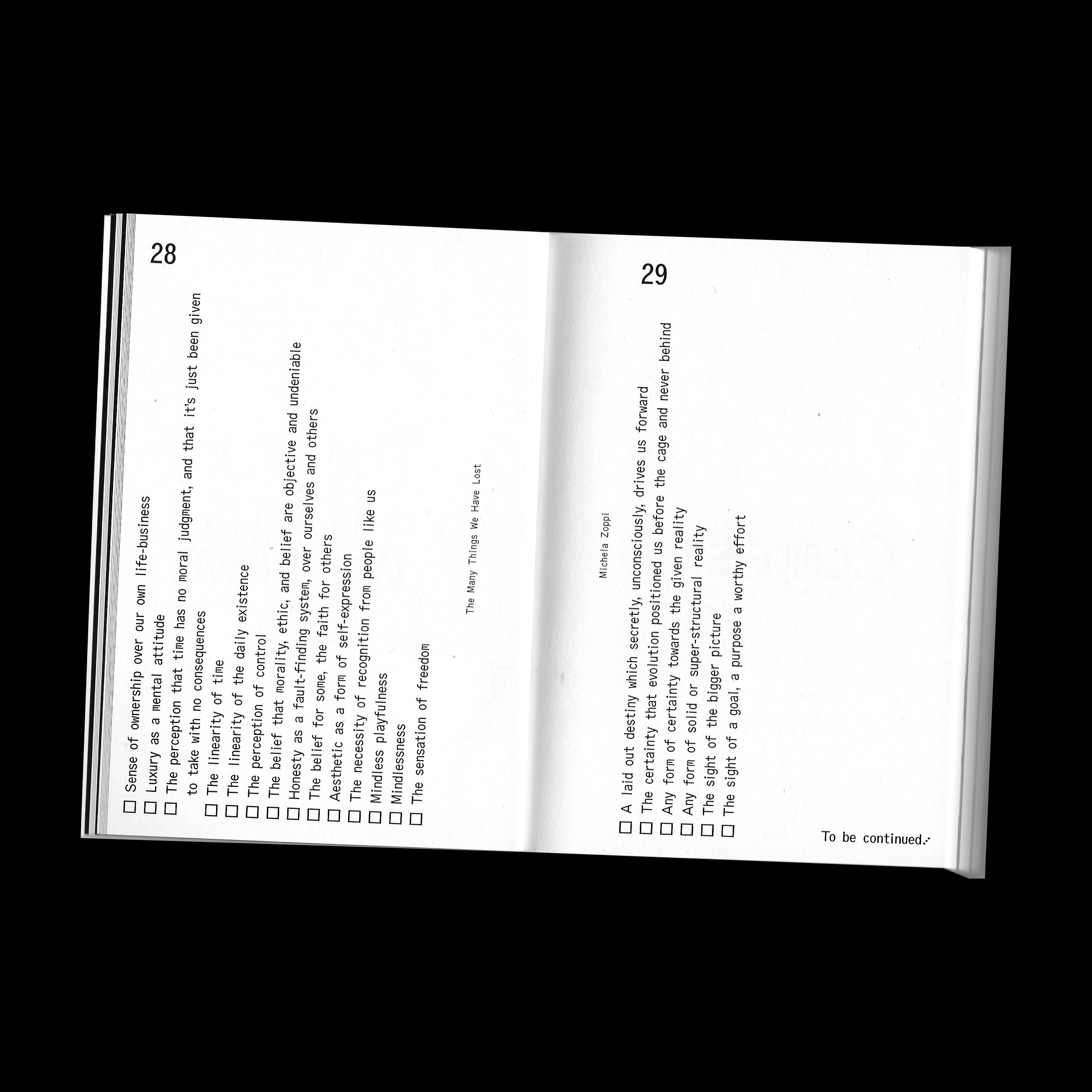
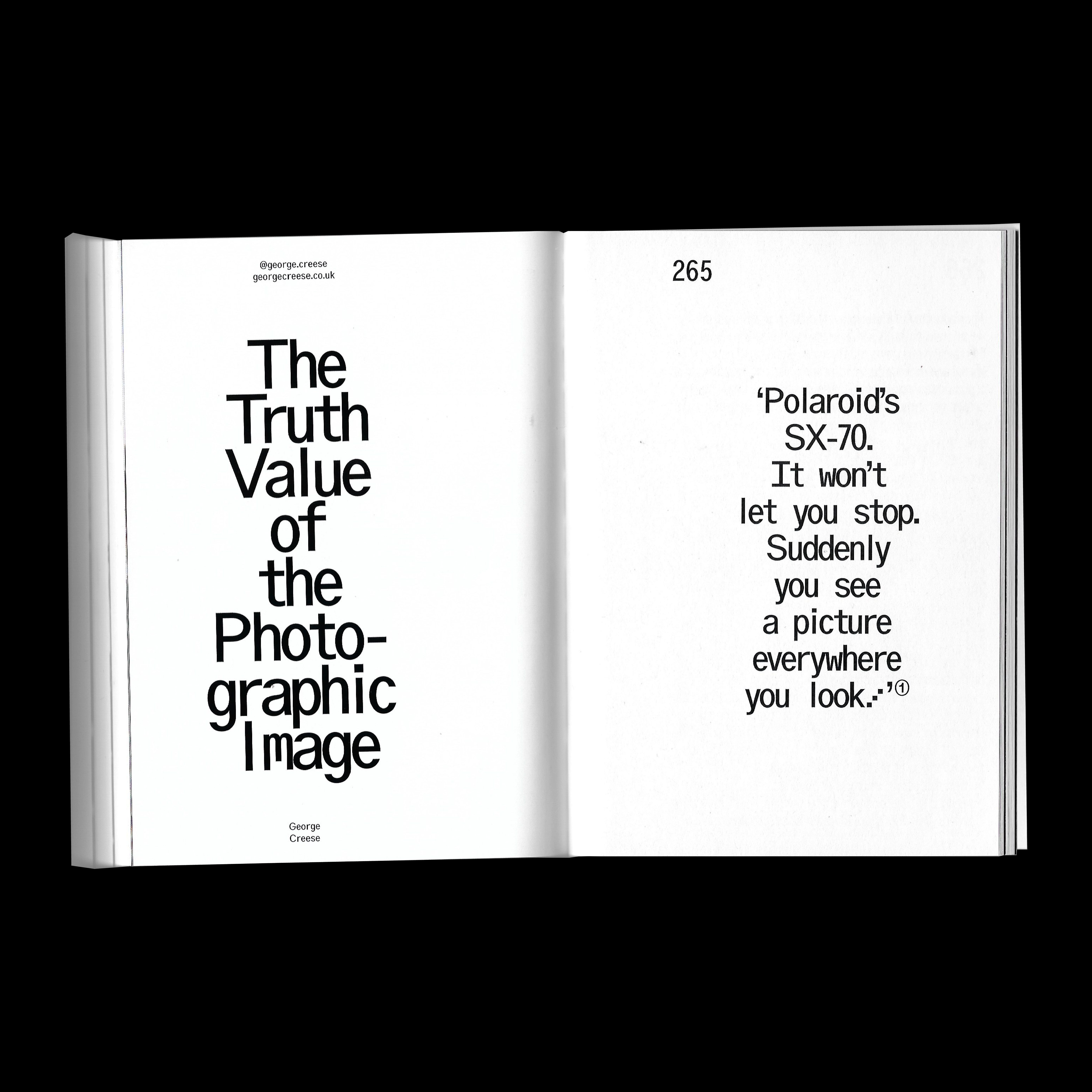
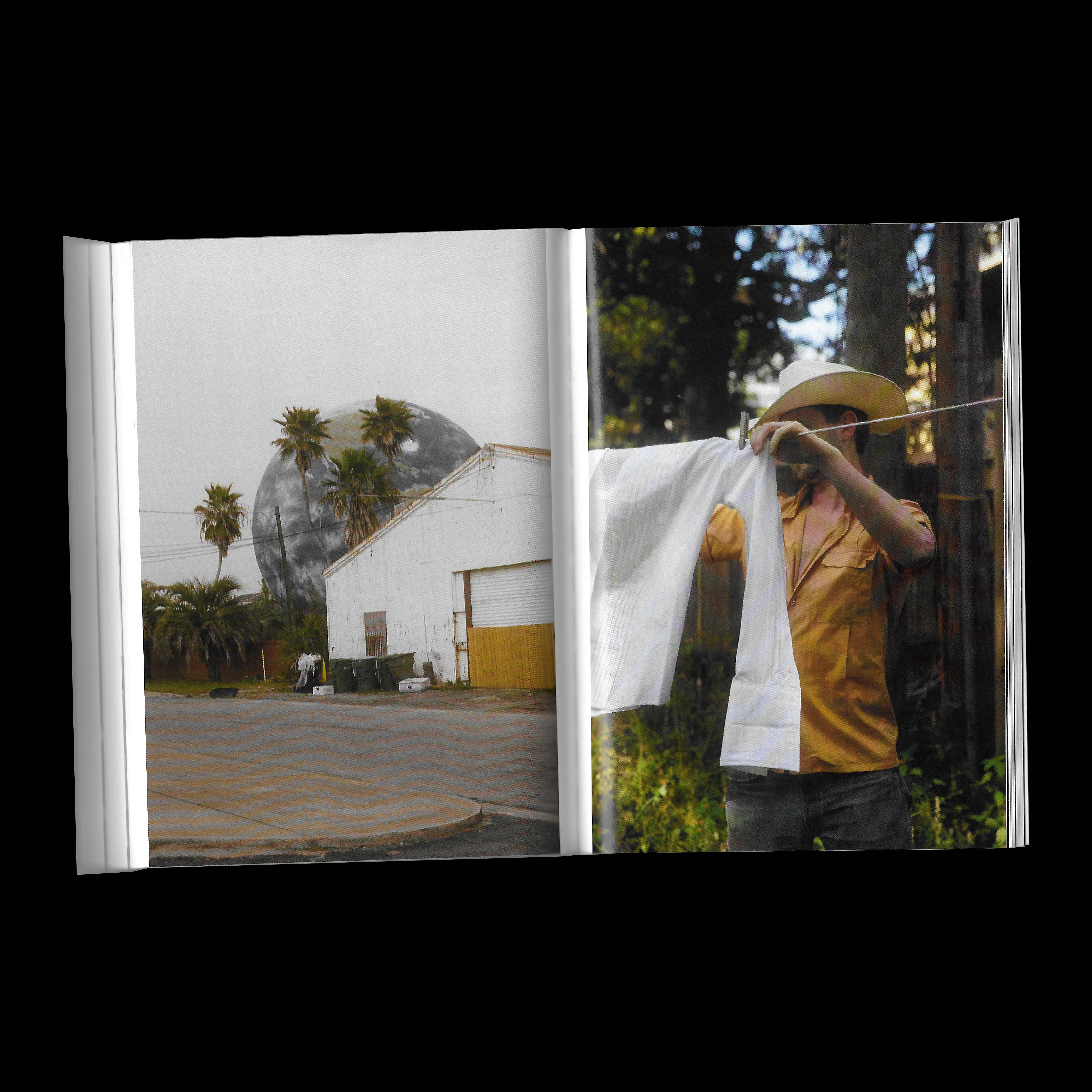
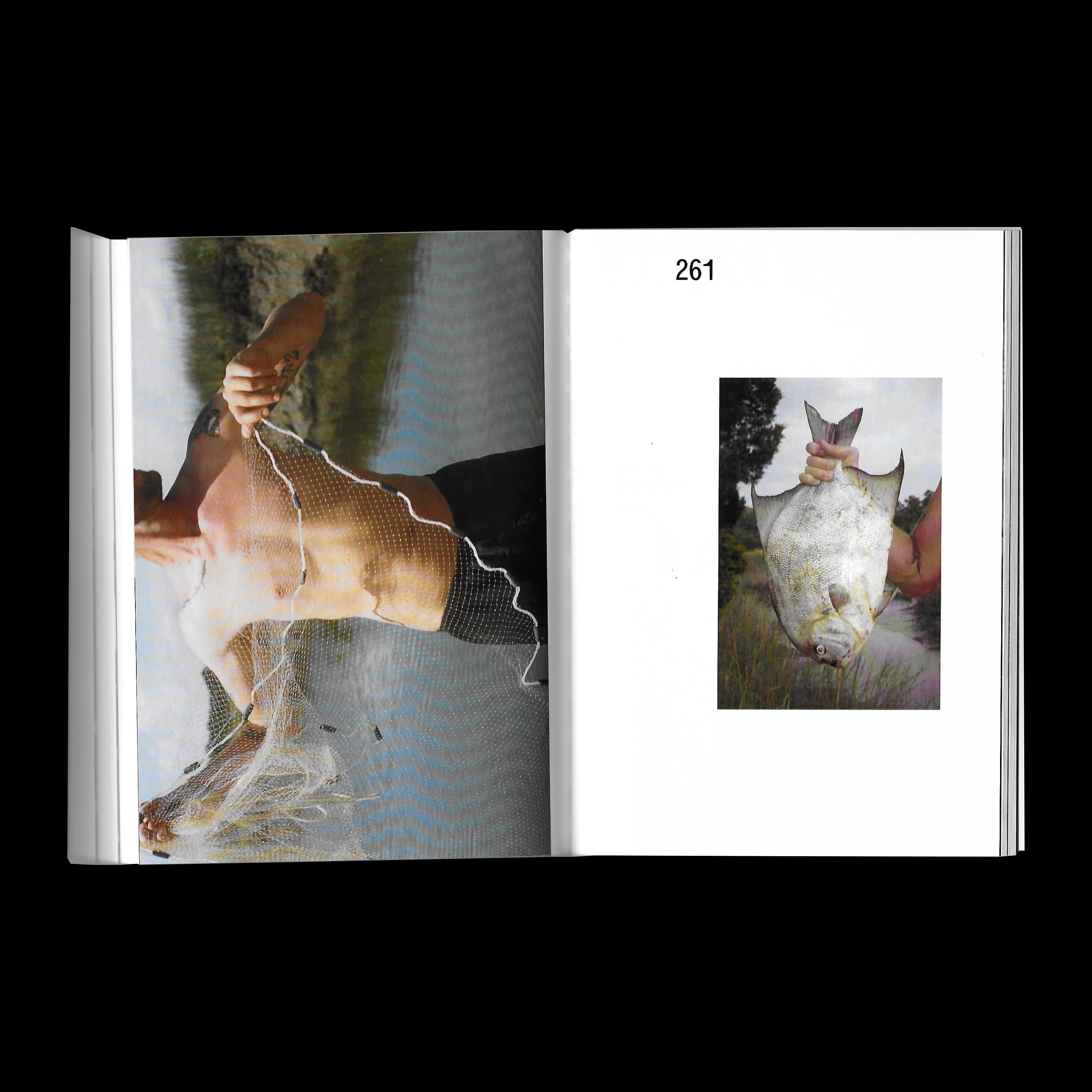

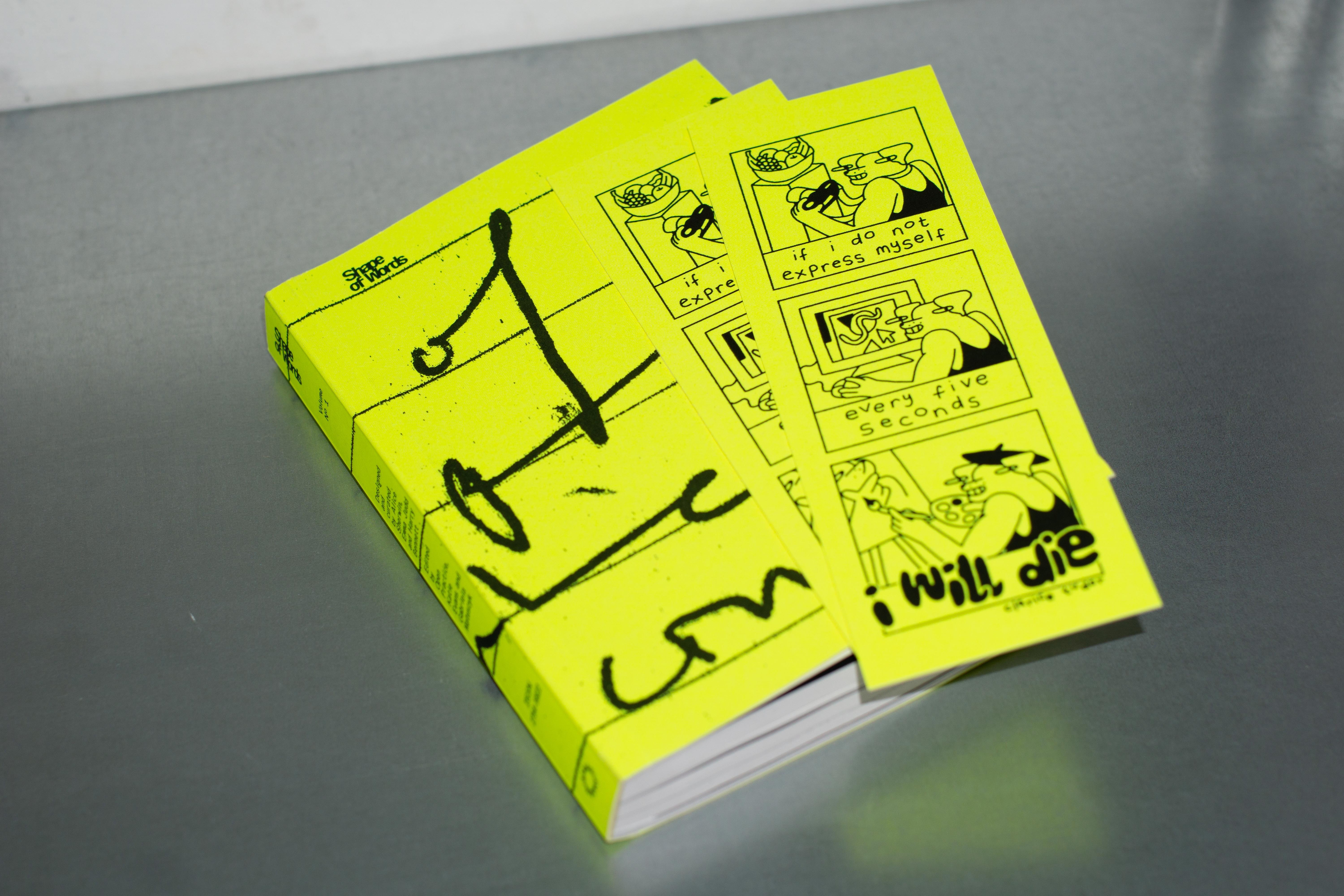
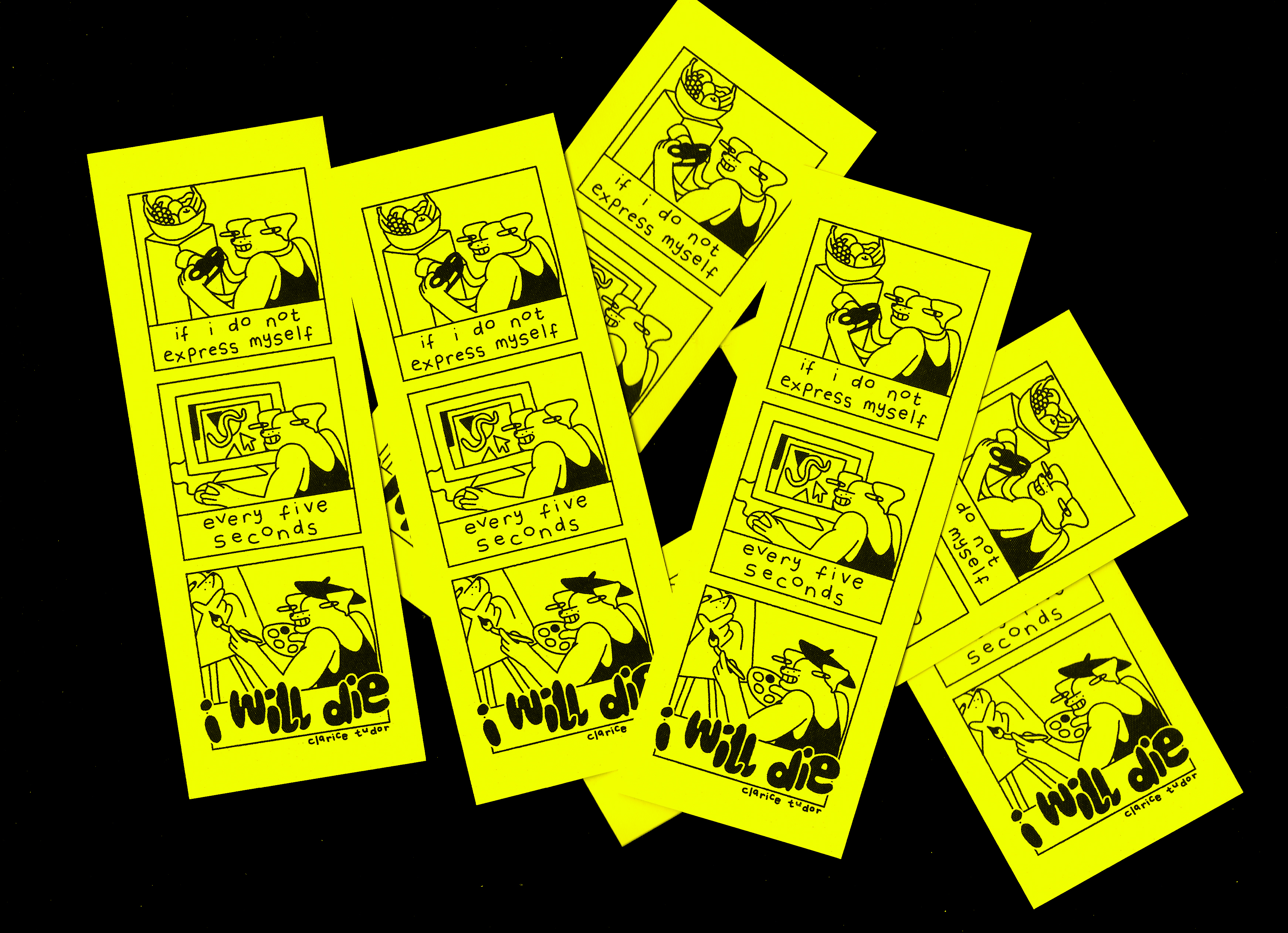
Featuring the likes of Dinamo, Laura Csoscán, Morgane Vantorre, Rene Matić and Anna Ottum (plus many more), it aims to peer behind the curtain and shed light on the thinking and processes behind a selection of current creatives.
> Available to buy here.
> Available to buy here.
Book
PP32
In collaboration with Studio Ground Floor and Pangram Pangram Foundry.
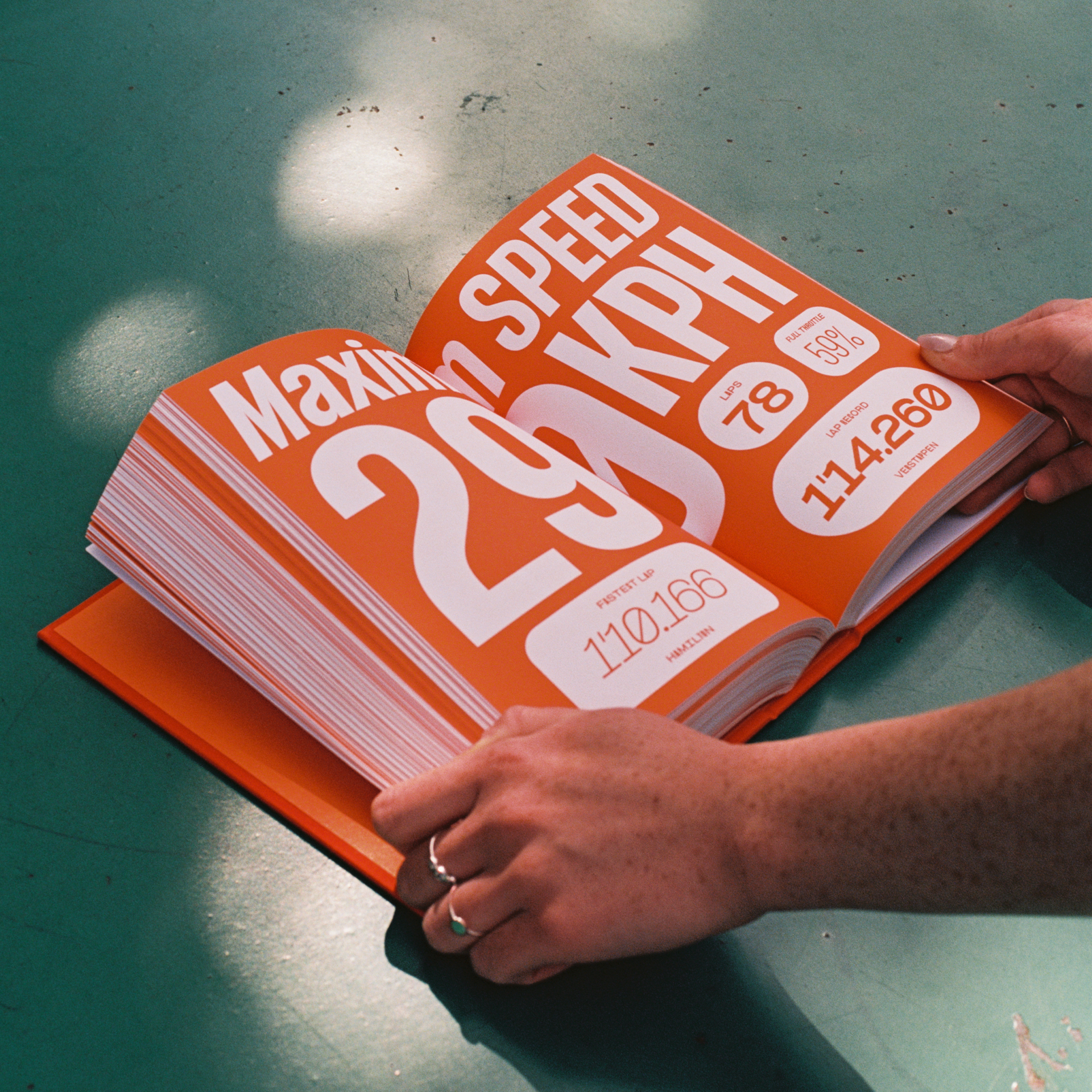
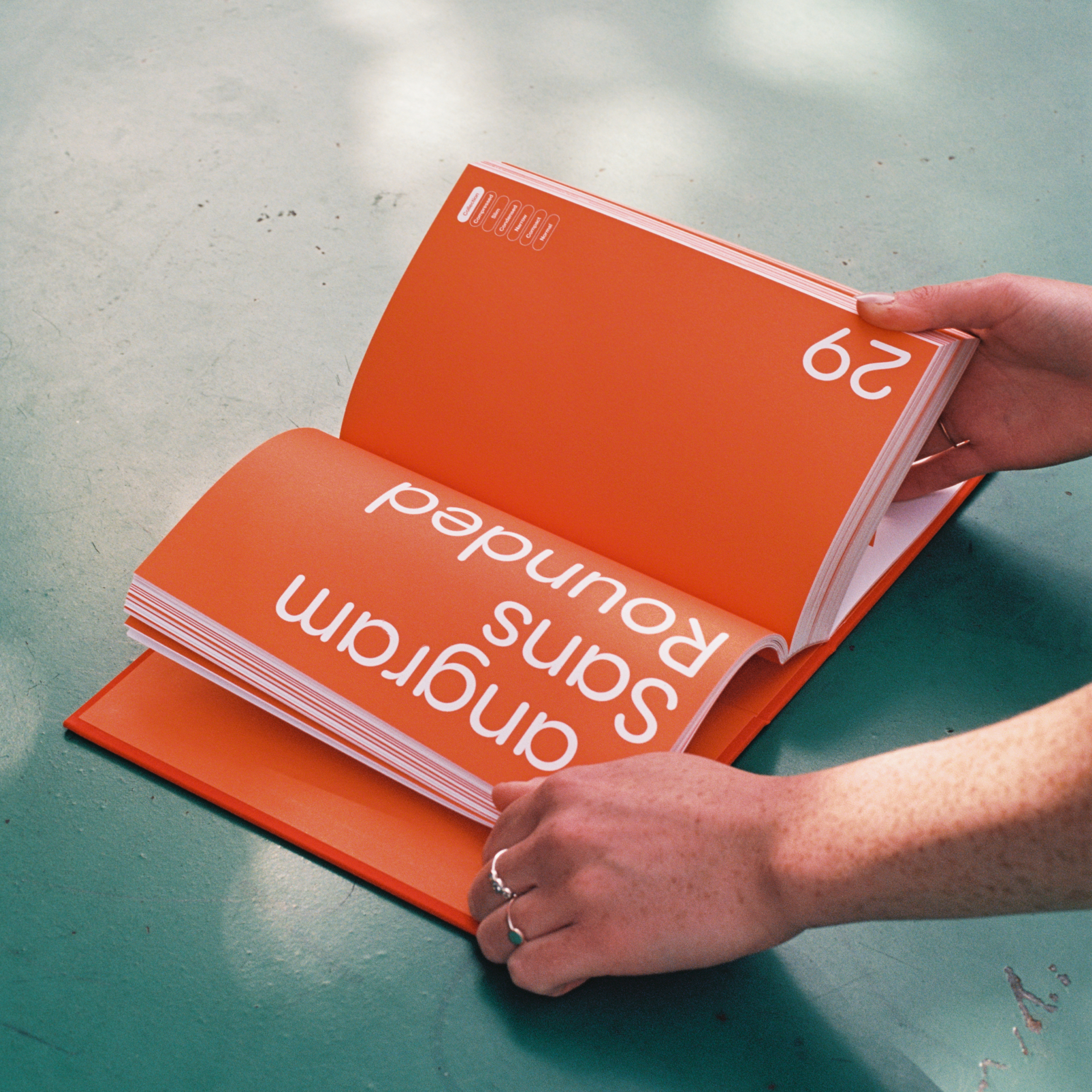
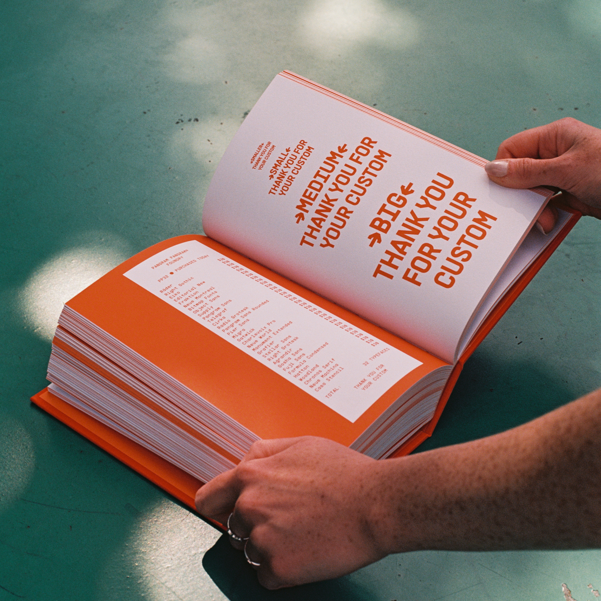
PP32 is a collated volume of 32 typefaces by Pangram Pangram. This collectable item aims to be a resource for typographic inspiration and has been designed to express the nuances and highlight the unique stories behind each individual typeface.


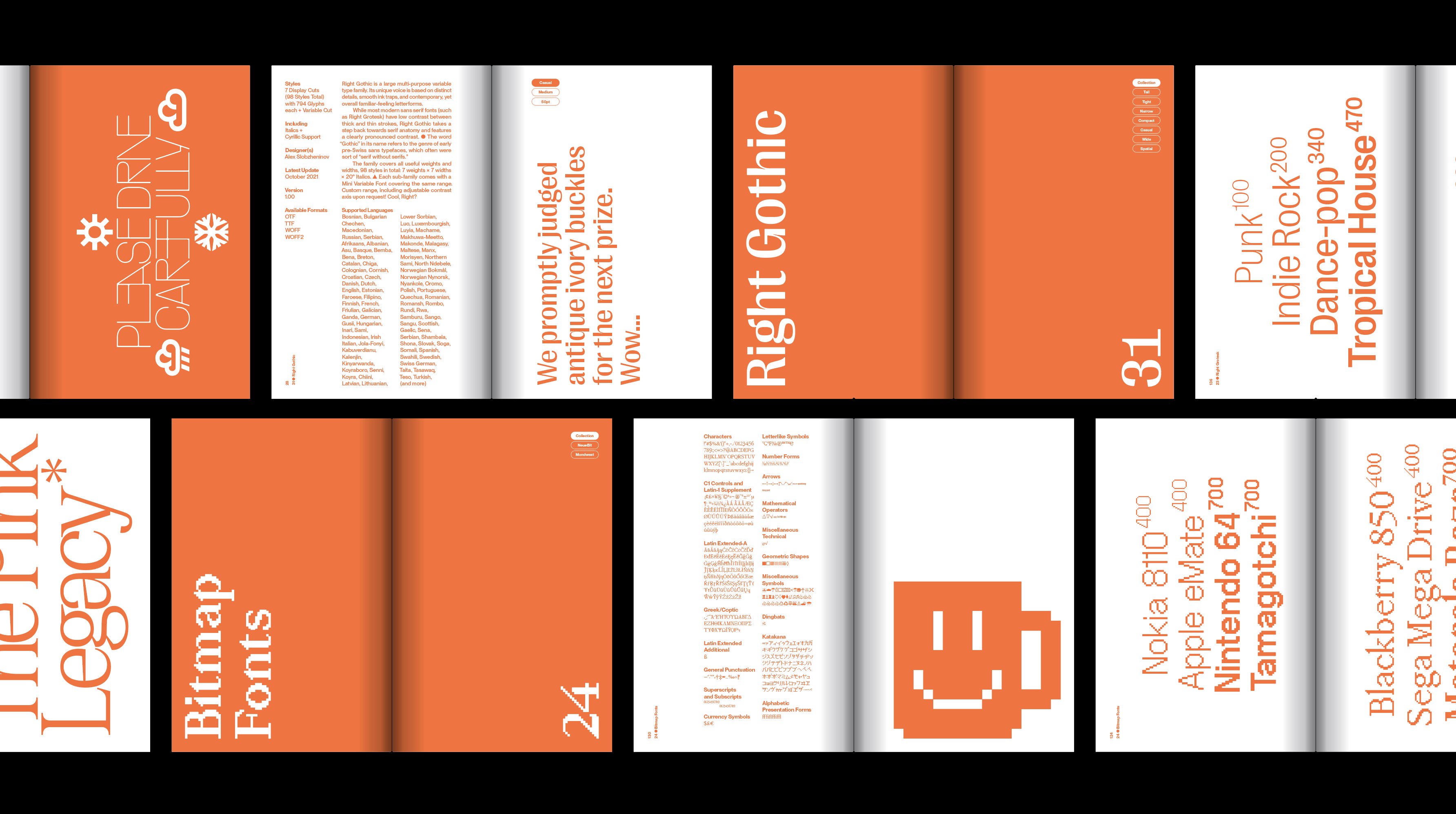
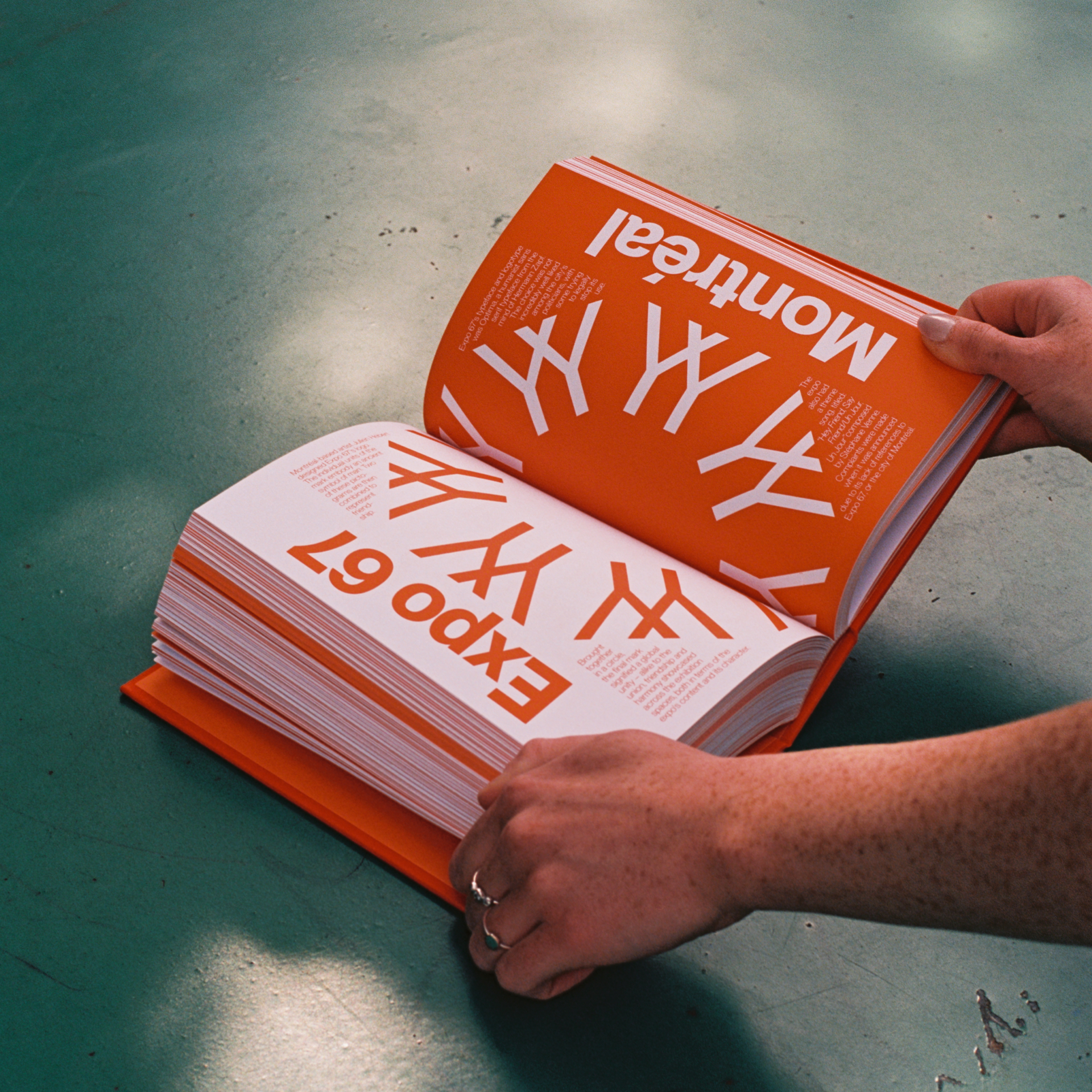

The idea behind the design of the PP32 Specimen Book was to recreate the sort of catalogs old foundries’ salesmen used to carry around to sell fonts to clients and ad agencies. We wanted to create a well made, stocky object with an undeniable presence. Following a beautifully functional grid system, the book allows the reader to compare the specs of each typeface whilst also containing more expressive pages that break the grid to play with the varying styles and weights.
> Find out more here.
> Find out more here.

Exhibition + Book
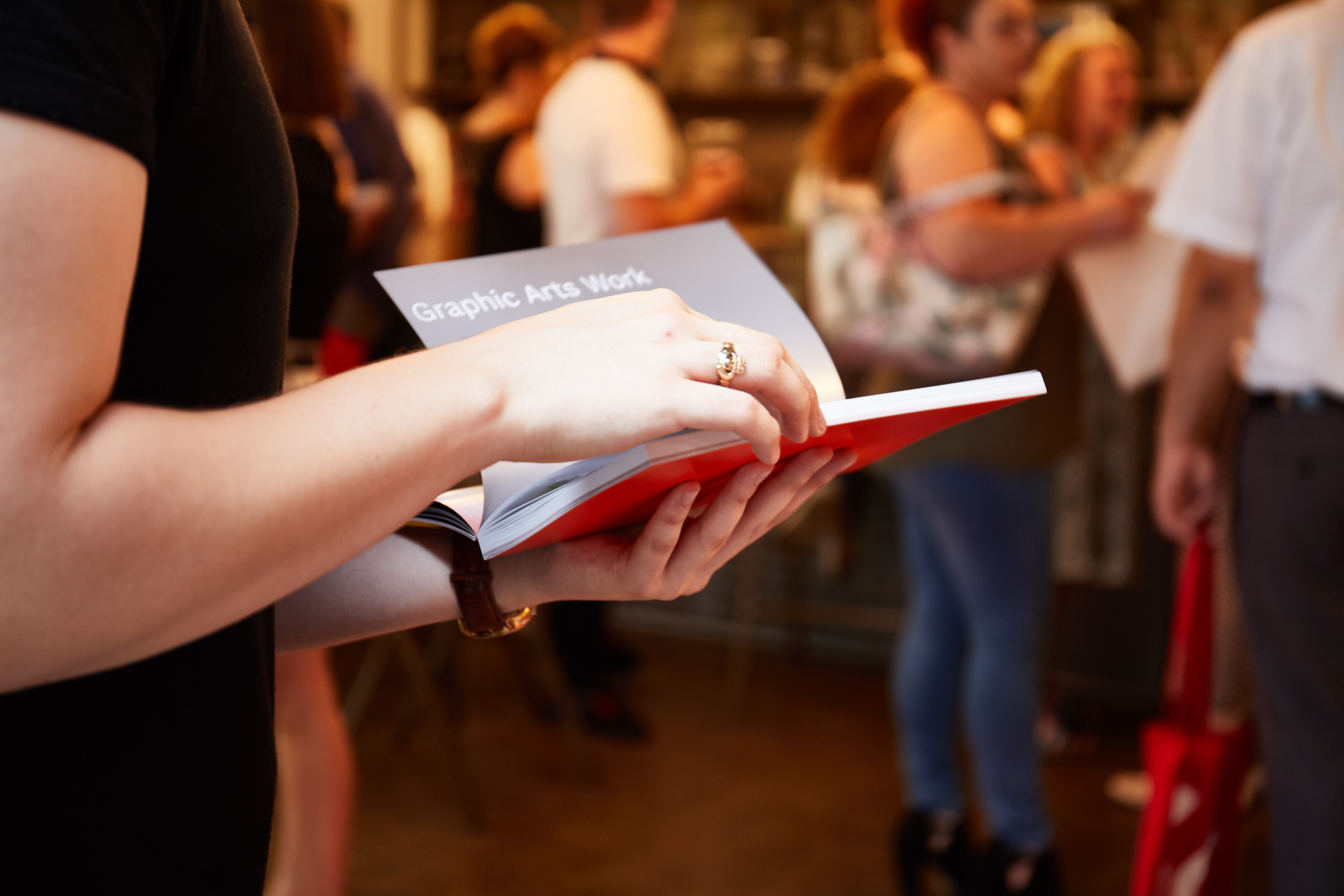
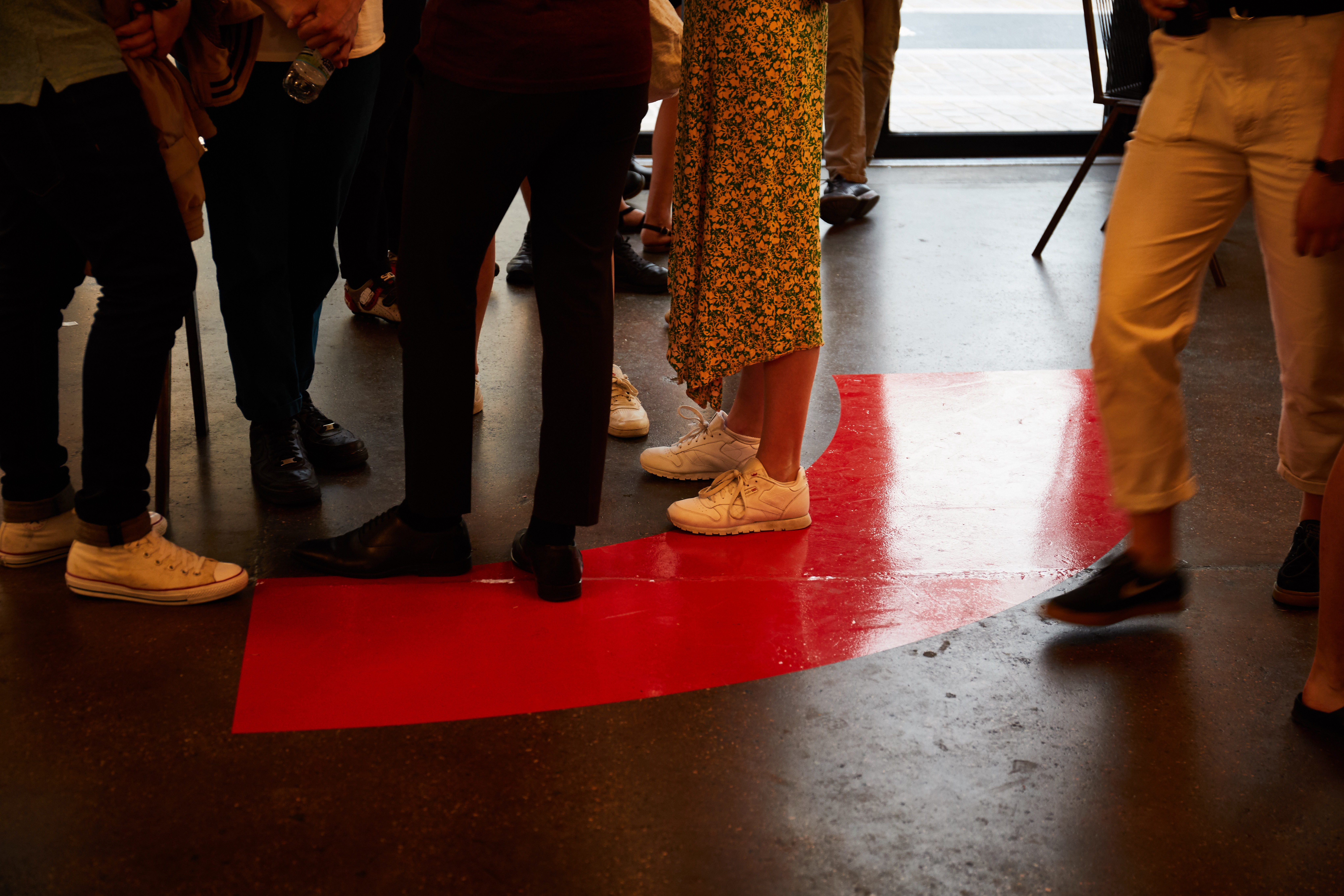
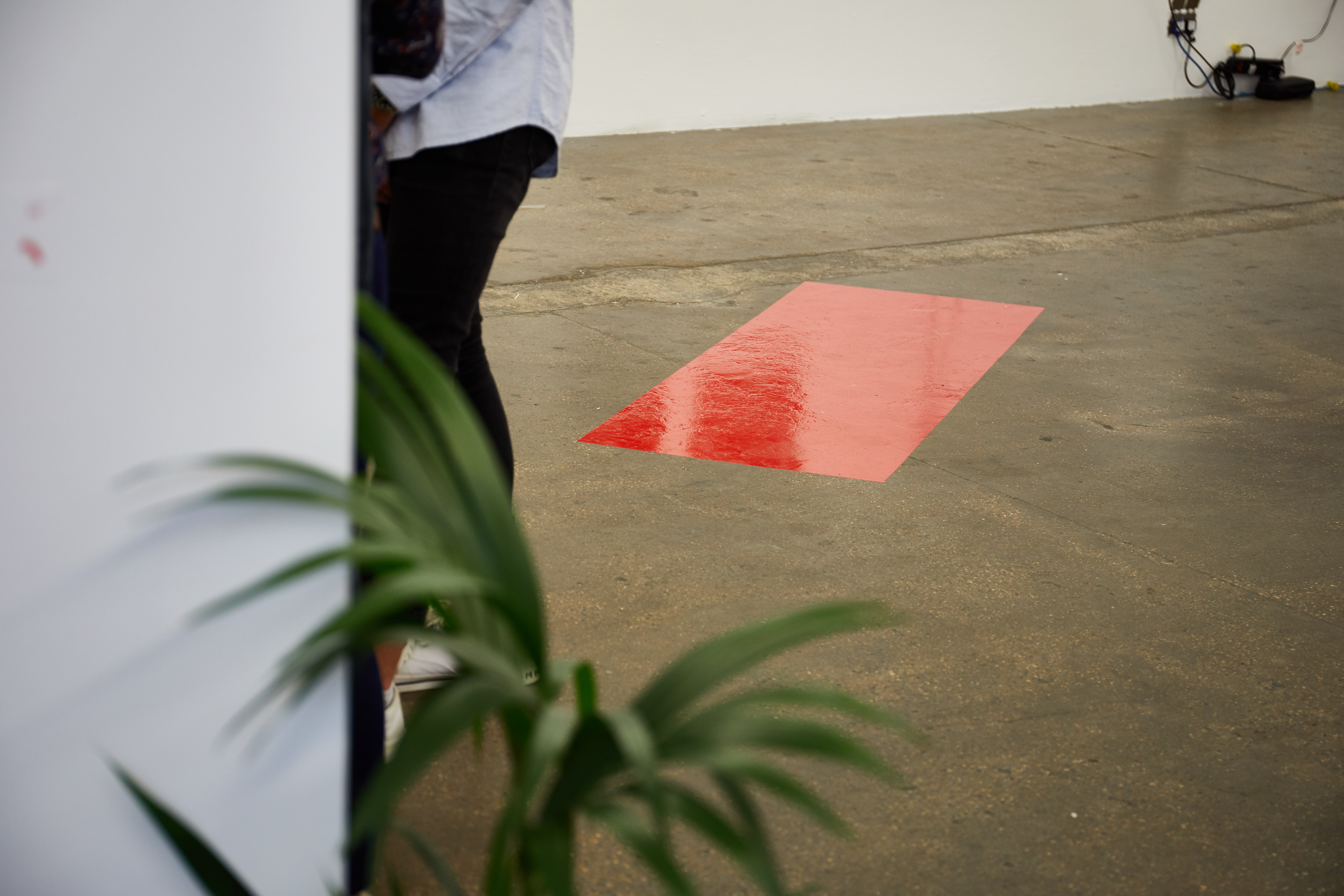
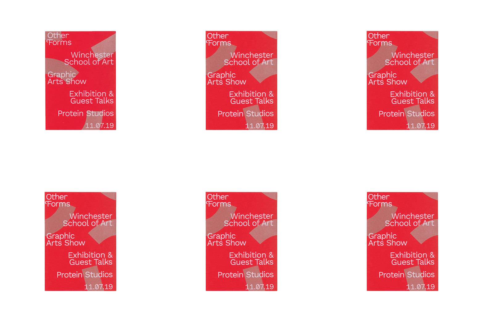
Other Forms
Designed at Winchester School of Art.
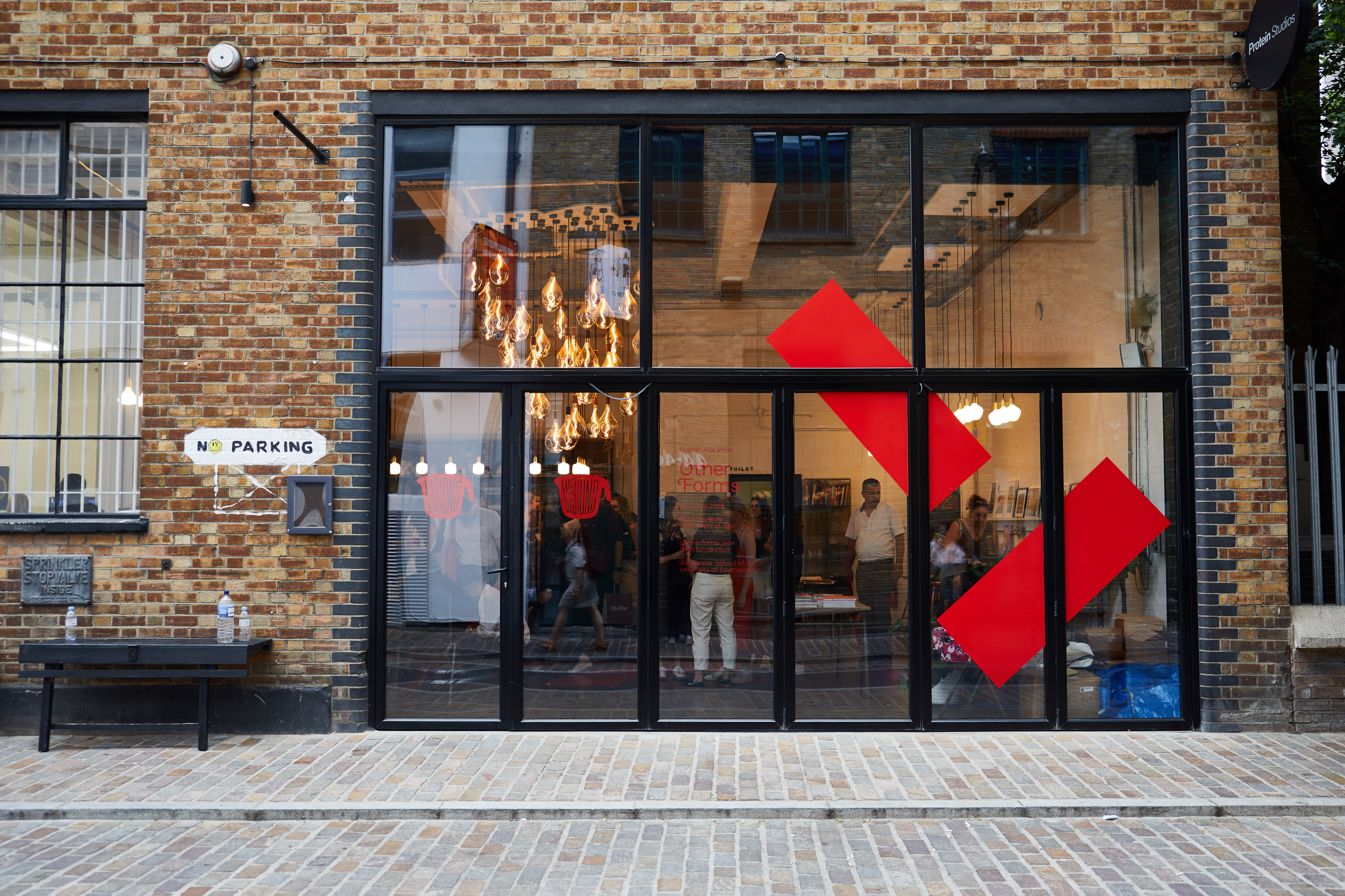
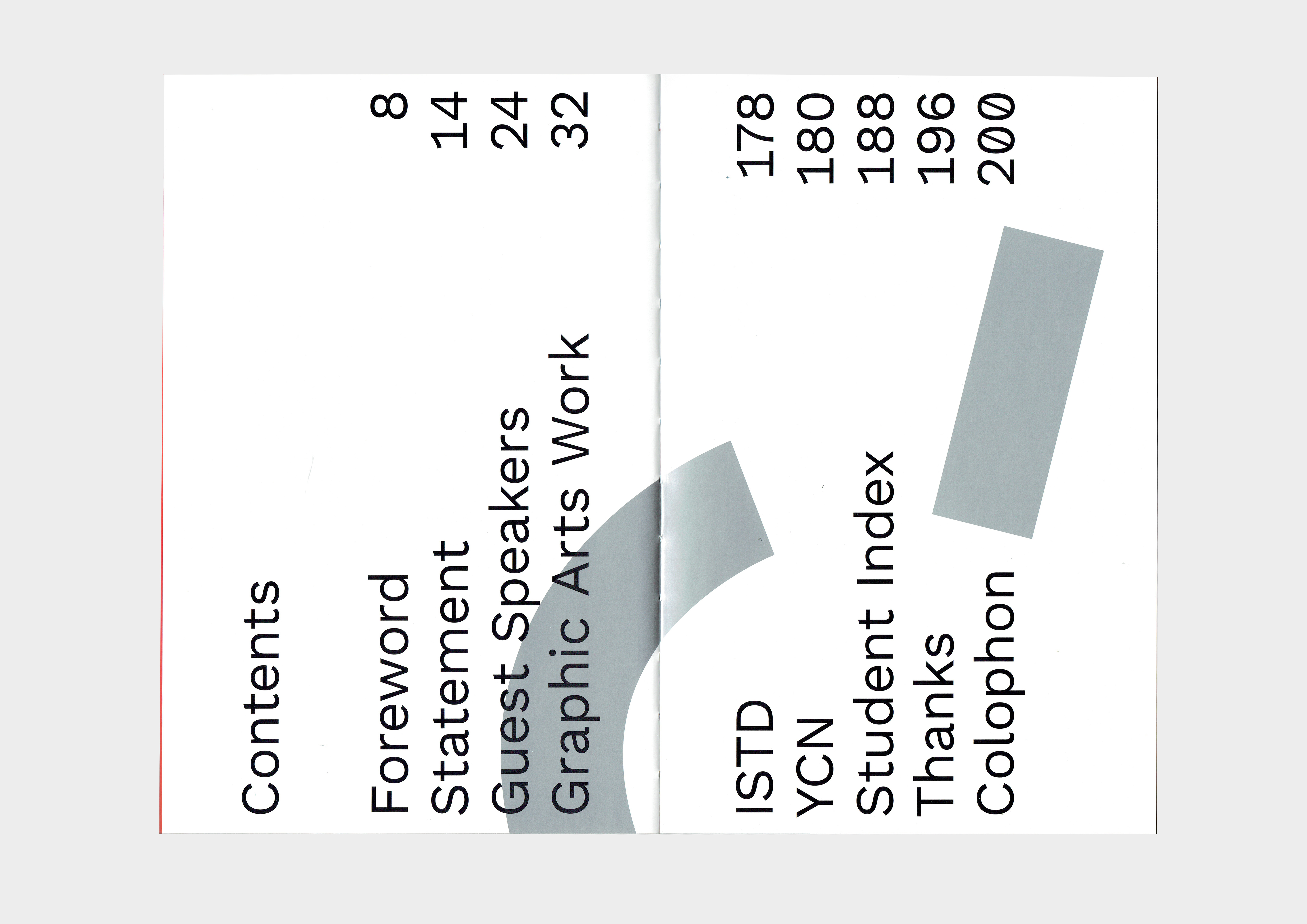
A bold and shapely identity for the WSA graduate show, held across two days, which celebrates a range of work from graphic design and illustration to textiles and photography. The forms initially came from the shape of the desks inside the 3rd year studio, which where always situated side by side to encourage collaboration between the different disciplines.



Book
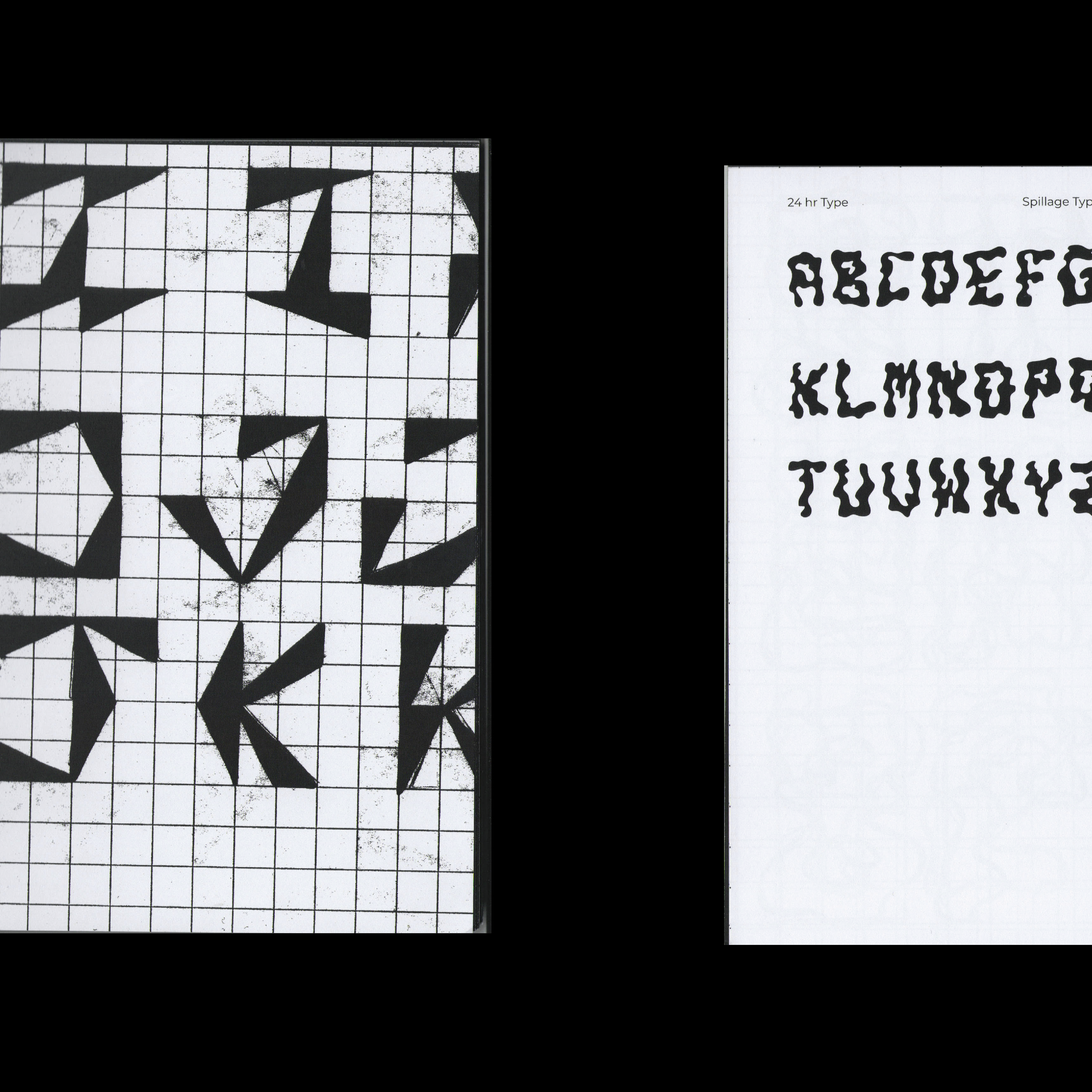
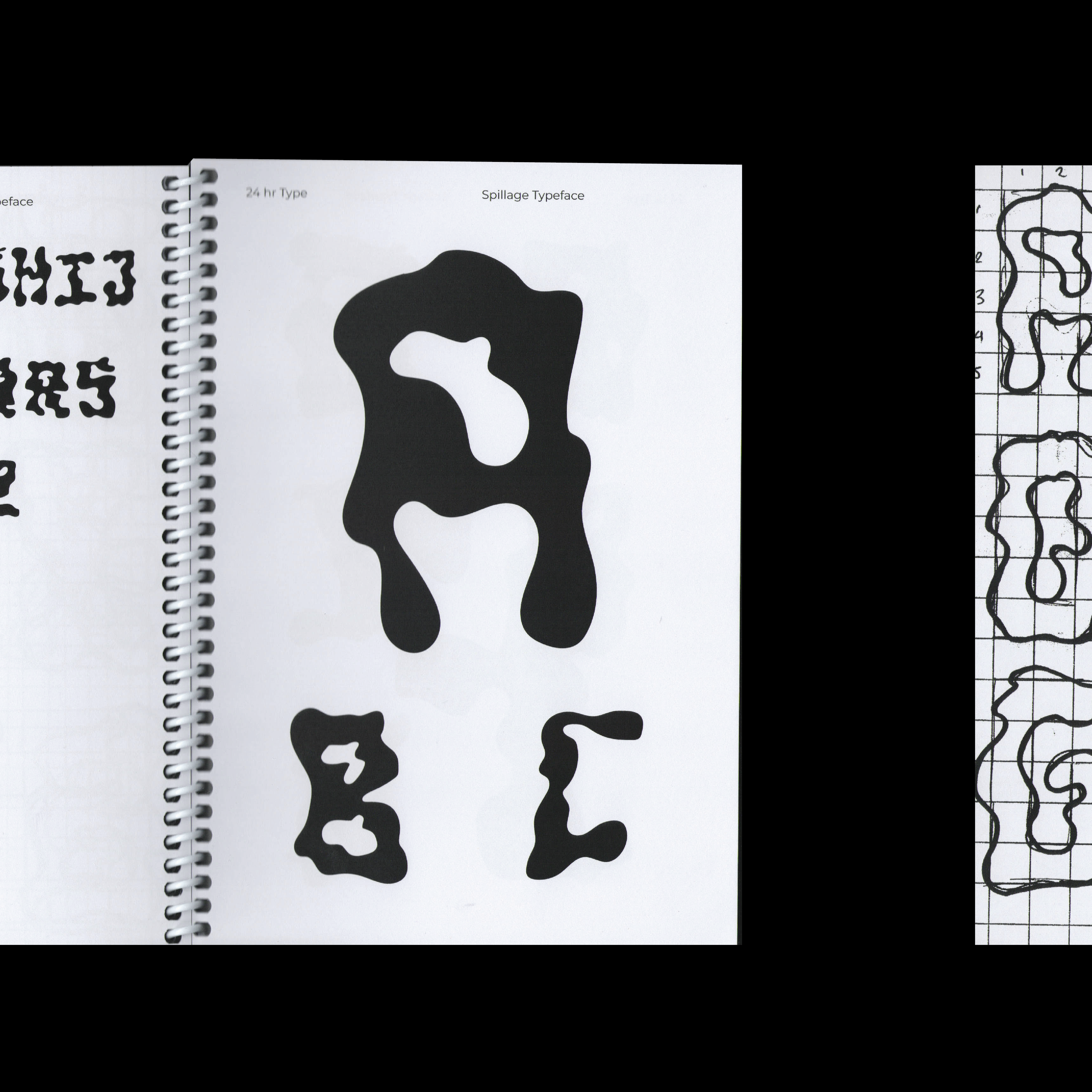
24HR Type

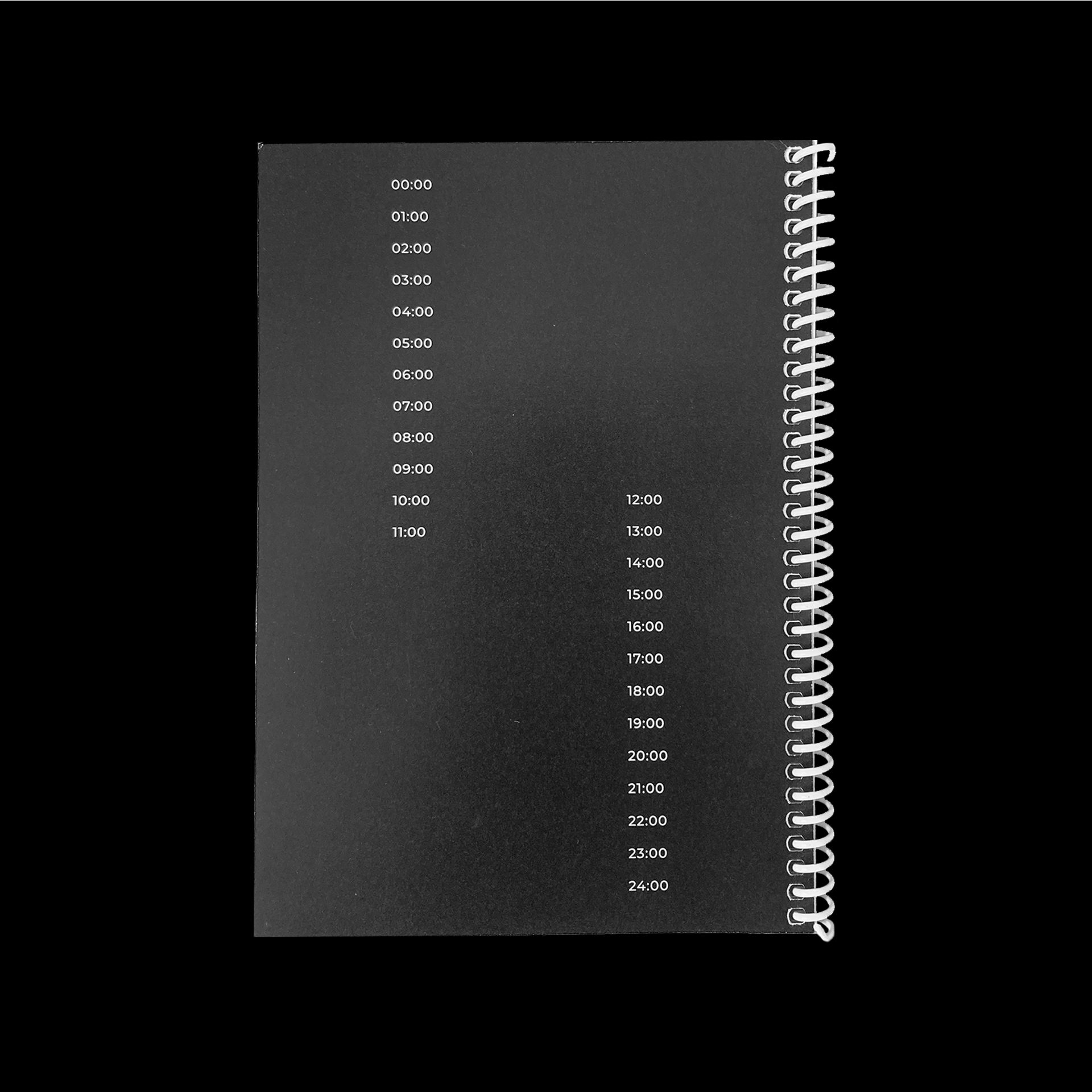
24HR Type documents four experimental typefaces created within a 24 hour period. The typefaces took inspiration from the things I saw and experienced around me, from the shape of windows on passing buildings (Acute typeface) to a news article on the oil spills in the Gulf of Mexico (Spillage typeface).
